How To Customize Blog Page Layout In Squarespace
Squarespace makes it easy to blog for your business but the default blog pages leave a lot to be desired. And while Squarespace 7.1 made great strides in what’s possible with the blog page, Squarespace 7.0 blog page is still pretty plain.
But with a little bit of clever use of the summary blocks we can change that. And that’s exactly what I’ll show you in this tutorial.
Click play to watch the tutorial or scroll below to get a recap of the steps.
How To Customize Blog Layout In Squarespace 7.0
First of all, let's walk through the options that you have available if you're blogging on Squarespace 7.0. Now, keep in mind that on the 7.0 version, you don't have a lot of built-in options to customize your blog page itself.
But, there is a way to create a more custom layout by using the summary blocks. And, I will show you how to do that once I've gone through the styling options for the blog page.
Accessing Blog Style Settings In Squarespace 7.0
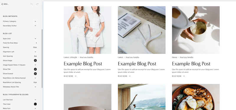
If you want to access the style options for the blog page, you'll go to Design > Style Settings. With your mouse, hover over the page until the blue lines appear. Then, click on the blog section within those blue lines. The Style Editor will shift you directly to the style options that apply to your blog.
Alternatively, you can enter blog into the search bar at the top and it'll bring up the same options for everything that's related to your blog section.
The style settings you can find here include:
Meta data display — you can control if you want the date and the author or the categories or location or comments to display. This is what's known as the metadata and if you want, you can select none for both of these options so that it doesn't display at all. This is useful if you only have a handful of categories or if you're the only author and you don't want to clutter up how the blog page looks.
Blog post display — the next option you have is how the blog post displays. You can choose between the grid or the stacked option and configure how many posts display per row, the spacing between the elements, the text alignment, featured image, the size of that image, and so on.
Font and colors settings — lastly, there are also options to control the typography and the colors for the blog post titles, the excerpt, and metadata
So, those are those are the options that you have available for the styling of the individual blog page.
Adding An Intro Section To Blog Page
Another thing that you can do with your blog page is add the intro section. You can add a little bit of text to it to make the page more appealing. You can also add, for example, a search bar block and an archive block that’s set to display categories in a drop down menu. The last thing that you can do here is to go to Settings and click on Media. You can then add a featured image. Click Save and now you have a more custom look for the default blog page in Squarespace 7.0. However, that still leaves you with a rather a plain looking blog.
So how can we spice this up? Well, I’m glad you asked!
Creating A Custom Blog Page With Summary Blocks In Squarespace 7.0
So, the first thing you’ll want to do is create a new index page and give it a name. Then, add a blank section. We’ll create a nice banner area for our blog first. In this section, add a banner image and then add a text block along with a search bar and archive block, just like we did above for the Intro section.
Add another section and give it a name. Let’s say we want to call it “lifestyle” to match with one of our blog categories and so we know what this section refers to. In this section, add a couple of space blocks to create a two column layout. Then, add a text block beneath each space. The first text block should say Lifestyle. The second text block should be a link that points to that category. Type in See All Posts In Lifestyle and link that to the Lifestyle blog category.
Once you have that set up, add the summary block. We're going to link it up to our blog page and this is where it gets super fun. When you click on filter items, you can filter by category (as well as by tags). Since I want to show only posts from the lifestyle category, I’m going to click on lifestyle. You can then style the summary block however you prefer. Click on Save.
Then, you can add another section that features your newsletter. So in this section, you’d add a newsletter block. But you can also get creative and showcase your products or your services — the sky is the limit so use this to showcase whatever makes most sense for your blog or business.
You can then add a few more sections with summary blocks, each pointing to a different category. And that is how you can create a more custom blog layout in Squarespace 7.0.
The last thing you’d want to do is make sure that this page shows up in your main navigation so don’t forget to drag this page to the primary navigation and drag your old blog page to the not linked section.
How To Customize Blog Page In Squarespace 7.1
When it comes to blog page in Squarespace 7.1, you have slightly more options than in 7.0. First of all, there are more layouts to choose from. You can control how the page looks in terms of content width and the meta information that displays above or below your blog posts. You can also customize the image display ratio and change the color of the blog section itself.
Secondly, you can add sections to the blog page itself and that makes this page very versatile. For example, I can easily add a headline section or a newsletter section or blank sections that make use of summary blocks to showcase posts from certain categories.
Thirdly, if you want to get a little bit more creative with how you display your blog posts, you can add a section with a list layout. Under Content, you can then link up the images or enable the button for each post and link it to individual blog posts.
Blog Styling Options In Squarespace 7.1
As far as the styling options go for the blog page itself, you can access them by going to Site Styles. Under Fonts, go to Assign styles and scroll down until you see the blog section. You can then adjust options that are available there.
Another thing that you can do is under Colors, you can style the theme of the section. For example, if you click on the Lightest theme (or whichever one your blog is using), you can change the colors for the blog post titles, meta, and so on.
Final Thoughts
So as you can see, there are quite a few more styling options available to you in Squarespace 7.1 Of course, if you’re not happy with it and want a completely custom look, you can still use the summary block trick to create an even more custom look for your blog page.
And that’s how you can create a more custom blog page layout in both Squarespace 7.0 and 7.1. And if you’re still working on your site and need a little help, don’t forget to download my free website roadmap.


