One-Page Squarespace Template
If you’re just getting started on your business journey, first of all congrats! Secondly, if you provide services of any kind, your primary focus should be to get as many clients on the phone as possible.
That means your website should get straight to the point and make it as easy as possible to make that happen. As such a one-page website might be just what you need. And in today’s video, I have a treat for you — a walkthrough of my one-page Squarespace template.
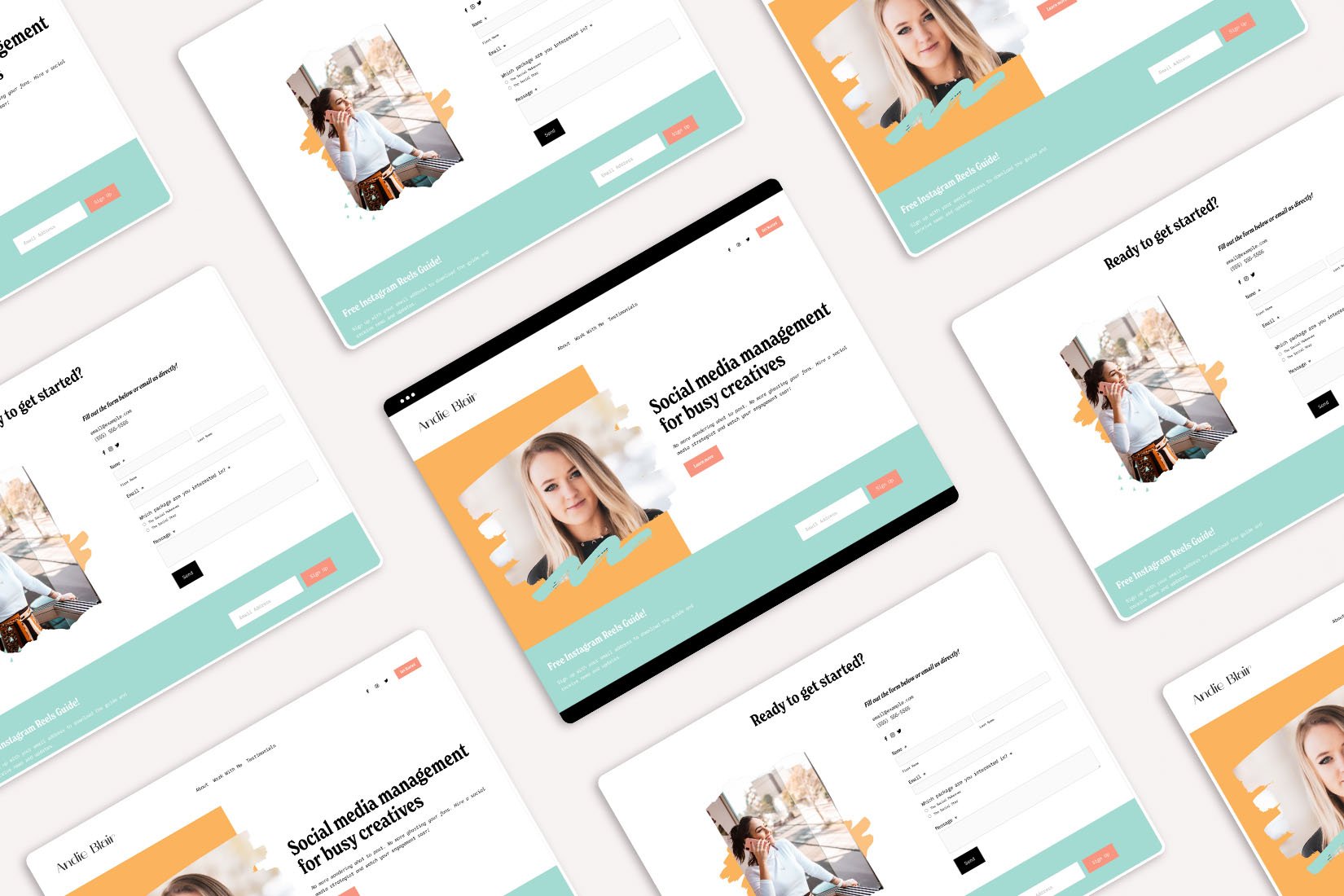
This one-page Squarespace template was designed with social media managers in mind but it can easily be adapted for any other service-based business.
Transcript: One-Page Squarespace template
Hey guys! In today's video I wanted to give you a brief walkthrough of the new template in my shop.
The template Andie was built with social media managers and newbies, business owners in mind. It's a very simple one-page template which is perfect if you're just getting started because chances are in your first year of business, what you offer is going to change so much.
So you don't want to build something complicated that's gonna require you to rebuild everything from scratch. That's just time consuming and not very practical when you're just getting started.
So if you're looking for a simple and quick and easy way to get started, a one-page template is a perfect choice!
Now as I've said this template has only one page, although you are getting a bonus Instagram links page since I tailored this to social media managers.
However, it can be used for other service providers like virtual assistants or copywriters. But basically, what I mean by this one page template is that it has different sections that uses anchor links for scrolling.
So basically an anchor link is when somebody clicks on this About page the template will immediately jump to the About section where they can learn more about you.
Similarly when they click this Work With Me, it'll go immediately to the Services section.
And then the Testimonials it'll go immediately to the Testimonial stuff.
And then the Get Started button will take them to the contact form where they can fill out the contact form and basically initiate the process of working with you.
Now the navigation is fixed in this template, which means it's always visible no matter how far down the page they scroll, which gives them an easy way to scroll back and forth through the page and jump through different sections.
In the header area we also have the social media links so they can follow you online.
And then this call to action that, as I've said, takes them to the contact form.
So what are the sections in this template?
So obviously we have the header section uh over here, which basically just tells them what you do and gives them a brief explanation of the services you provide.
And then we have the button that takes them directly to the packages.
We also have an email signup form so you can grow your email list and nurture subscribers into becoming clients.
Then we have the about section, which shares information about you.
And then the Work With Me button over here takes them again to the packages.
The packages section uh uses two image cards to describe the services.
Again this is perfect when you're just getting started because you don't really have a lot that you can include until you've worked with a certain number of people.
So you don't really have an accurate idea of what you want to be offered, what you need to include in that service, and everything else. So this gives you a great starting point where you can include the basics and then invite them to basically get started on working with you.
We also have the section for logos with clients that you've worked with before that you can include.
And then testimonials from past clients to build trust.
And then finally, the contact section with the contact form where they can choose which package they're interested in, send you a brief message, and send you the contact form.
And then we have the photo guy, the footer section, which again has the email signup form.
And then a very simple photo that shares a brief sentence of what it is that you do and then links to the signup form.
The packages, again at the top, the contact section to work with you and then has your social media links so they can follow you online.
Again the entire template is easy to customize and it comes with bonus graphics that are used in the header area.
And here for the services area, that you can customize to match your brand. And those are Canva templates that I will be sharing with you once you purchase this template, in case you decide it's the perfect template for you.
Now as I've mentioned before, it comes with an Instagram links page and I'll show you how that looks. So basically it is a very simple page that has no section, no footer, or no header area; so that this is done on purpose so they can do... they can take the action that you want them to take.
So they can either sign up for your newsletter form, or you can take them directly to your services page... or rather the services section on your home page so they can view the services and then book you.
In case you want to learn more about this template you can visit my website at leydesignstudio.com/templates and you can view the demo of the template for yourself and learn more about it and how the whole process works.
That's it for today's video and I'll see you in the next one!
Check out the template:
More posts like these:
Pin it for later:


